
How effective is the combination of your main product (video) and ancillary texts (digipak and advertisement)
For my A2 media coursework it was necessary alongside with creating a music video to create a digipak and advert.
Before starting the production of both my ancillary products it was necessary to research using the help of Google and Wikipedia,the style and genre i would like to follow,


Using both Google and Wikipedia i browsed digipak's of;
Using both Google and Wikipedia i browsed digipak's of;
I also similar to researching digipacks researched using Google magazine adverts


After researching and browsing the above adverts, i realised likewise to digipaks magazine adverts also incorporated the artists image, name, song titles and CD release date.
I found influence from the above magazine advertisements which play a crucial pert in my advert creation i found that these adverts very good as they cover all the conventions of ancillary products,Everything is in place, as it all seems to link in and therefore connects with each aspect. The font is clear and really goes with the artist and genre and all pictures are in focus. Another important aspect i really liked of these adverts is how they link to their actual style of music.
Jerome, Ayub, Sayf, Mohammed from 283goswell on Vimeo.


As you can see from watching this video and comparing it to Bubles advert you can see their is the same dress sense, antique use of colours and elegant props.
From Sean Paul's video above you can see a visual link between it and the advert where there is the frequent use of neon lights and bling.
Keeping in mind of all the above i tried to replicate what the above artist have done by trying my best to match my video with the digipak and advert.
Below is the music video both i and my group produced

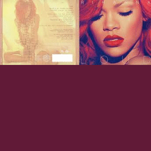
As you can see above is a screen grab of my official digipak.
Below is a screen grab of the advert created in regards to promoting the music video produced.


Above is a A3 poster i have created using Photo shop element where i have in correspondence tried to layout what main three things are visual throughout
After closely watching all four items created above, targeted at a target audience of teenagers and young adults you should be able to see that i have keeping in mind my target audience and the main product have created a digipak and advert that uses the same font colour, Orange, yellow and white, same font style and size Georgia, regular, 12pt, same images of artist and use of text in Japanese writing. I personally believe that by including all of the above my target audience of young adults and teenagers will be able to easily recognise that my products follow a consistent style making them able to recognise that the above digipak and advert belongs to my music video.
No comments:
Post a Comment