Question 2
The fact that our album is similar to our video is shown through many ways.
If a fan was to watch our music video, they'd easily be able to link the album with the video because they are both in the same environment. The viewer can clearly see that Ayo is wearing the same bowler hat and the has the same building behind him as shown in the chorus of our video.
The font is also inspired because of the song. The fact that the font is smooth and curvy, reflects the smooth nature of our song itself.
A screenshot from the chorus of our music video
The actual digipak
The colour of the font (dark orange), was done because the background image contained the colour of orange because of the street lights in the distance. Due to this reason i wanted to emulate the same tone of colour in order to create a sort of motif.
The font style of this digipak was all set the same. I used a smooth font throughout the album cover and advert in order to portray our character as a smooth and shady character. This is also emphasised though the fact that the images for both Album and Advert was taken at night, with darkness having connotations of mystery and uncertainty.
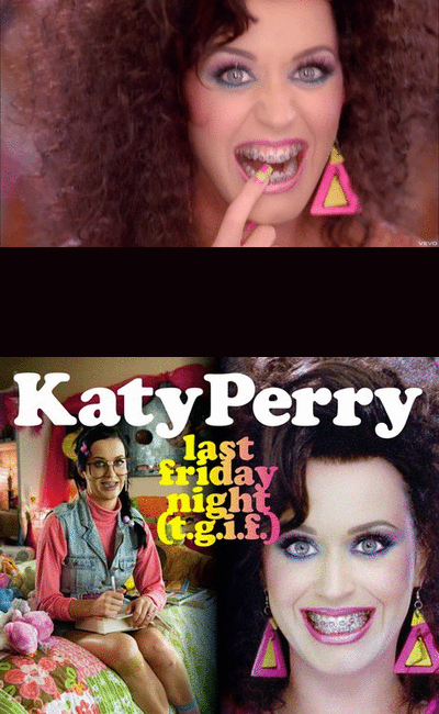
After doing some research, i found out that famous and successful videos have similarities between the artist in the video and the way the artist looks in their album cover.
The album cover for the album by Katy Perry entitled 'T.G.I.F' is majorly similar to the way she looks in her music video 'Last friday night', as shown below...

This meant that i had to have some sort of house-style theme with both my video and digipak in order to help the buyer establish and recognise who the artist is after watching the music video.
The same font of (Caviar Dreams) which was created through the font making program on the mac named 'FontScape'. The exact same font was used on the Advert and Album. However, I used the 'Andes' font to name the artist in the advert. This is because I wanted to create a stylish and sort of mature connotations of our artist, Ayo. The font size used for the name of the artist on both Album and Advert is the size 60. This large font size was used in order to bring to attention the artists name as bring more recognition to the artist as he is a new debut artist.

The above is my Album inside cover, compared to Lil Wayne's back cover. The idea i took from Lil Wayne's album is the use of the 3 bars which creates an artistic style of imagery. I also continued my house-style theme by using the same 'Caviar Dreams' font from fontcase, and by using the same Dark Orange colour for the font.


No comments:
Post a Comment